Writing Design Briefs For Taiwanese Illustrators And Designers
Sick of design briefs that leave Taiwanese illustrators guessing and spit out generic art?
Write your brief like you're chatting over bubble tea, warm and short, tied to a real place so artists can feel the scene, not just follow directions. Think the clink of ice, the sweet hit of brown sugar, the neon glow of a Taipei night market, those little details help.
Call out Taiwan color meanings, festival timing, and small notes like Mazu (the sea goddess many Taiwanese worship at temples). Tell artists if you want the mist rolling off Sun Moon Lake, the sizzle of stinky tofu, or a calm temple incense vibe.
When you do this, work moves faster with fewer back-and-forths and the art looks honest and local, you know? Less guessing, fewer revisions.
Below you'll find a short checklist, friendly style tips, and a fill-in template to help you write briefs that save time, cut edits, and make illustrations that actually fit Taiwan’s culture.
Crafting Culturally Attuned Design Briefs for Taiwanese Illustrators and Designers
Write briefs like you’re chatting over bubble tea. Keep it warm, clear, and rooted in place so illustrators feel the brief, not just read it. When you flag Taiwan color meanings, local festivals, and storytelling notes, work moves faster and the art feels honest, like the neon glow of a Taipei night market.
Quick-Start Checklist for design briefs that speak to Taiwanese illustrators and designers:
- Objectives & Scope , One-line summary of the goal, audience, deliverables, and usage rights. Short, scan-friendly.
- Cultural Considerations , Note festival timing, color meanings (red often signals good fortune), indigenous motifs, and respectful icon use. Add a brief parenthetical when you name local customs, like Lantern Festival (where people release sky lanterns) or Mazu (the sea goddess many Taiwanese worship at temples).
- Visual Style Guidelines , Attach reference images, a mood board, texture notes, and clear do/don’t examples. Visuals make style way easier to match.
- Technical Specifications , List file formats, color mode (RGB or CMYK), resolution, final size, bleed, and rules for bilingual text. Be precise so exports don’t bounce back.
- Timelines & Budget , Give milestone dates, review windows, how many revisions are expected, and a budget range. People need to plan around tea breaks and Taipei traffic, you know?
- Communication Etiquette , Name one decision-maker, call out preferred tools (Slack, Google Drive, Figma), and set expected response times across time zones. Keep replies predictable.
- Localization Tips , Clarify whether you want Traditional or Simplified Chinese, font preferences for Chinese typography, and any translation or cultural edits you’ll handle. Little notes save big headaches.
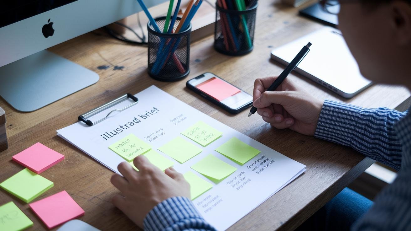
- Sample Template & Example , Include a filled brief or mockup so illustrators can quote and start with confidence. Seeing a finished example speeds everything up.
A tiny sample line to copy:
“Project: [Name] | Client: [Brand] | Deadline: [MM/DD/YYYY]”
Love clear briefs. They make creative work feel like a shared night market stroll, fun, focused, and full of flavor.
Defining Objectives and Scope in Design Briefs for Taiwanese Illustrators
Start with one clear line that says what success looks like. Think of it as the project headline , one sentence that tells the illustrator the goal, the main deliverable, and how you’ll judge the work. Short, clear, and helpful. You’ll get quotes and timelines faster this way.
For the brief’s objectives, include the basics: project name for tracking, a short note about the brand or team, and the project’s purpose inside your org , marketing, packaging, exhibition, you name it. Add a simple acceptance criterion, like "final art approved when hero image prints at 300 dpi with no color shifts." Measurable. Friendly. Easy to check.
Target audience analysis matters a lot. Say age, market segment, and language needs , for example, Traditional Chinese (the script used in Taiwan). Say the emotional reaction you want , laugh, trust, nostalgia , and where the art will live: phone wallpaper, A2 poster, or a kids’ picture book. This helps the artist pick tone and detail without guessing.
Want a quick tip? Describe the vibe like you’re picking a bubble tea flavor: start with the base audience, then add the extra notes , humor, nostalgia, or boldness. It makes choices feel simple, you know?
For project scope, list specifics so there’s no guessing:
- Number and type of illustrations (cover, interior spreads, icons)
- Sizes, final file formats, color mode, and DPI (example: RGB for screens, CMYK for print, 300 dpi for large posters)
- Where the art will be used (social, print, packaging) and territorial usage rights
- Number of revision rounds and rough milestone dates
Also add a short exclusions list , what you’re not asking for. And name one decision-maker who can sign off. One person keeps things moving.
Little structure tweaks like these cut down back-and-forth. Trust me, your illustrator will thank you.
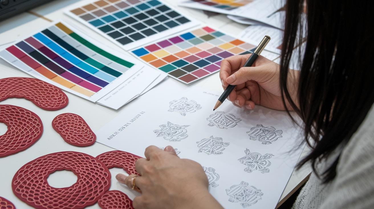
Integrating Taiwanese Cultural Considerations into Your Design Brief
When you outline cultural notes for Taiwan, be specific. Name your color intentions, call out rituals to respect, and say exactly where the work will live, web banner, product label, shop window, festival float, or a temple mural. A short, clear line like "Palette: jade green for harmony; avoid gold on red in funeral contexts" gives Taiwanese illustrators a quick, useful starting point.
Attach photos of real places so the vibe is honest. Think hand-painted tea shop signs, the neon glow of Taipei night markets, the sizzle of stinky tofu, or woven patterns from the Amis (one of Taiwan’s indigenous groups known for bold geometric weaving). These sensory images help artists match texture, color, and scale instead of guessing.
Ask about tools and techniques up front. Do you want ink wash with digital coloring, brush calligraphy accents, or layered paper textures? Say whether the artist needs to provide traditional tools or if you’ll cover them. And tell them if you expect high-res scans of hand-made elements.
Call out festival icons and storytelling cues with tiny notes, and explain why they matter. Dragon Boat Festival (races and zongzi, sticky rice parcels), Moon Festival lanterns, temple processions, say when you want these used and the tone you’re after. Are they background texture, a focal pattern, or a respectful nod? That helps artists avoid pastiche.
Include a short do/don’t list about religious and indigenous imagery. Examples:
- Do: credit the community, offer a small cultural fee, and consult local experts.
- Don’t: use sacred emblems as decoration without permission or treat ritual objects as props.
Give 3–5 photo references and one-line permission guidance. Example: attach photos of a temple facade, a night market stall, a woven sash, and a tea shop sign, then add: "Check with local consultant before finalizing temple motifs."
A little context goes a long way. Say who the audience is, share a quick anecdote if it helps, Have you ever strolled under lanterns at Jiufen?, and keep notes short and practical. That way the art feels native, not copied, and everyone’s on the same page.
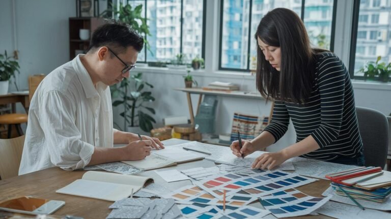
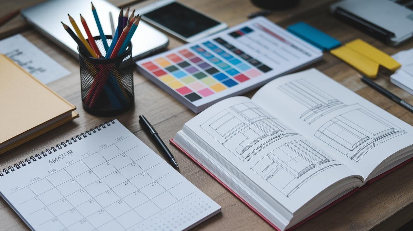
Specifying Visual Style Guidelines and Reference Materials in Your Design Brief for Taiwanese Designers
Clear visual style guidelines cut down the guesswork and get artwork closer to what you want on the first try. Say how the final mood should feel, then show examples that match that mood so the illustrator knows what to aim for.
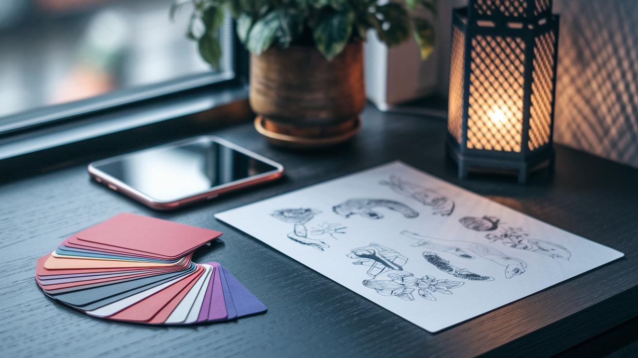
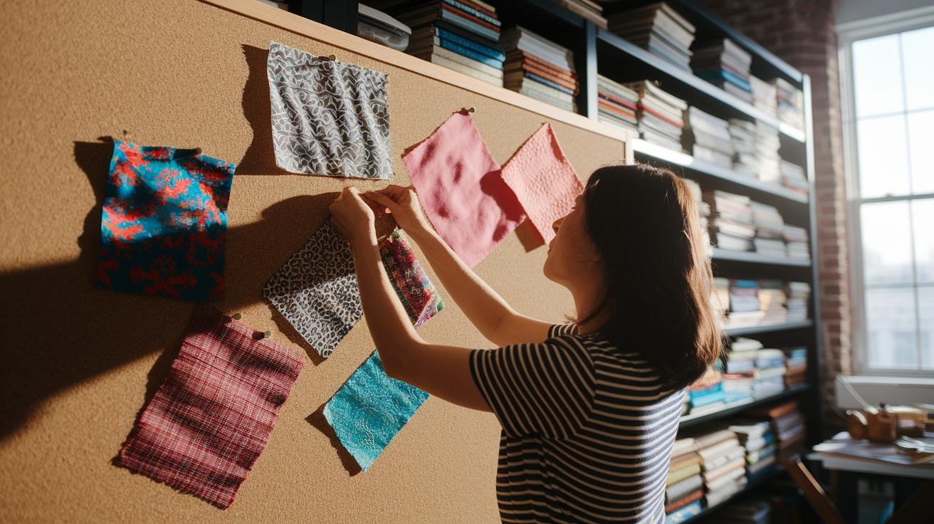
Quick, practical steps for gathering style references and making a mood board:
- Collect 8 to 12 images from Pinterest, artist portfolios, and Google that show the textures, line work, and composition you like. Label each image with one short note like "color," "texture," or "composition" so nothing gets lost in translation.
- Put those images into a simple mood board , a PDF or a Figma frame works great , and group them by theme: color studies, character sketches, and pattern samples. A clean layout helps the illustrator understand scale and detail, and it makes feedback faster.
- Add Taiwan-specific art references: local packaging, calligraphy strokes, or indigenous weaving photos (indigenous weaving = woven patterns from Taiwan's indigenous tribes). These show real-world materials and how patterns sit at different scales, which matters a lot for printing and fabric.
- Include your brand assets: color swatches with hex and CMYK values, clear logo usage rules, and typography samples. If you need bilingual text, add sample phrases in Traditional Chinese (Traditional Chinese = characters used in Taiwan) and note your preferred typeface.
- Put brief technical notes under each image: preferred file format, desired resolution, and any usage limits or permissions. For example, say if handmade textures should be scanned at 600 dpi and saved as TIFFs.
- Ask illustrators to point to 2 or 3 portfolio pieces that match your brief so you both share the same visual language. It speeds up alignment and avoids surprises.
Little practical tips that actually help:
- Use short captions and neat file names like "mood_color-palette.png" or "ref_pattern_taiwan_weave.jpg." It sounds small, but it saves hours later.
- Think of picking reference images like choosing a bubble tea flavor , start with the base mood, then pick your visual add-ins. Mix and match, but keep the main direction clear.
- If you can, include one real-world sample photo , a product mockup, a label shot, or a photo of a craft you love. Seeing materials and scale in a real context is worth a dozen flat images.
When you write the brief, keep it cozy and specific. Say what mood you want in plain terms , warm and hand-drawn, or crisp and modern , and give one or two do-not-do examples. That makes everyone’s job easier, and you get closer to the final piece on the first pass.
Establishing Technical Details in Design Briefs for Taiwanese Illustrators
Note: typography specifics were moved to Localization Tips / Visual Style (Traditional vs Simplified script, preferred typefaces, line-height and kerning, vertical text rules, font licensing and embedding, and supplying final copy in the requested script).
Compact checklist (one-line why + exact how + quick example)
-
Required master and deliverable file types , keeps edits possible and production smooth.
How: Provide AI or EPS as the master vectors; PSD or TIFF as layered raster masters; PDF as print-ready; PNG, JPEG, or SVG for web.
Example: AI (master), project_v01_print.pdf (print-ready). -
Colour profiles , make sure print or screen looks right.
How: Use CMYK with the printer’s profile for press (for example, CMYK Coated FOGRA39); use sRGB for screens.
Example: Export a press PDF in CMYK (printer profile) and an sRGB PNG for the website. -
Resolution standards , avoid soft or pixelated final art.
How: 300 dpi for print; 72 dpi for screens. Export at the final trim size.
Example: 300 dpi at final trim size for a brochure. -
Bleed and safe margins , stop important elements from getting trimmed off.
How: Set bleed to 3 to 5 mm; keep critical text and logos at least 5 to 10 mm inside the trim.
Example: Trim 210 x 297 mm, bleed 216 x 303 mm, safe margin 5 mm. -
Layers, masks, and editable text , so files stay editable and fonts stay correct.
How: Supply layered masters (AI, PSD, TIFF) with live text when possible. If embedding fonts isn’t allowed, outline text and include font files or licensing info.
Example: Leave text live in AI and attach OTF/TTF or a PDF with fonts embedded. -
Page versus spread export , controls imposition and web slices.
How: Specify single pages or spreads for print; provide sprite sheets or sliced PNGs for web assets.
Example: Export a two-page spread as spread.pdf for layout proof, and single-page PDFs for press. -
Naming and versioning convention , avoids confusion across review rounds.
How: Use projectname_v01_role.ext (role = print, web, master). Keep it consistent.
Example: lotusposter_v03_print.pdf. -
Export, web compression, and transparency notes , preserve color and alpha where needed.
How: For web, use PNG for transparency, compressed JPEGs for photos (quality 70–85), and SVG for vector UI. For print, flatten transparencies in PDFs unless the printer asks for live transparency.
Example: hero-image.jpg (quality 80), logo.png (transparent).
File type quick map:
| Format | Use |
|---|---|
| AI / EPS | Master vector files (edit source) |
| PSD / TIFF | Layered raster files (editable comps) |
| Print-ready (embed fonts, CMYK profile) | |
| PNG / JPEG / SVG | Web assets (PNG for transparency, JPEG for photos, SVG for vector) |
Planning Timelines, Budgets, and Deliverables in Design Briefs for Taiwanese Designers
Clear milestones, a fair budget range, and a tight deliverables list stop surprises and keep projects moving. Good deadlines help illustrators plan around studio hours, the hum of the printer, and local holidays like Lunar New Year or Dragon Boat Festival, you know?
Lay out a simple milestone map with dates and who’s responsible. Keep each item short and obvious:
- Draft delivery – sketches or comps, date and file format.
- Feedback rounds – windows for comments and expected response times.
- Revised draft – date for the second pass.
- Final hand-off – final files, invoice, and client sign-off.
Use clear deadline language like "Draft 1 due MM/DD – client feedback within 5 business days" so there’s no guessing.
Be upfront about budgets. Give a range or a fixed figure, note payment terms, and list typical costs. For example, a 20-page children’s book might sit near $5,000, but style, complexity, and licensing change that number. Say whether you want a deposit – 30 to 50% is common – when the final payment is due, and if extra expenses like travel, props, or translation are covered. Call out taxes or platform fees so no one gets an awkward bill later.
Make the deliverables list exact and short. Include:
- Number and type of illustrations – cover, interiors, thumbnails.
- Final file formats and color mode – AI master (editable Illustrator file), PDF print CMYK (for print shops), PNG web sRGB (for online).
- Sizes, bleed, and resolution – e.g., 300 dpi for print.
- Usage rights and territory – web only, Taiwan retail, or worldwide.
- Naming convention – projectname_v02_role.ext
Be explicit about revisions. State how many rounds are included, the typical turnaround per round (3 to 7 business days is common), and the hourly or flat fee for extra edits. A clear revision policy cuts the back-and-forth and keeps the creative energy flowing.
Quick practical tip: attach a one-page calendar with milestone dates and payment triggers. It’s a tiny file but it saves tons of emails, trust me.
Effective Communication and Collaboration Etiquette in Design Briefs with Taiwanese Illustrators

Quick guide for smooth work with Taiwanese illustrators. Think friendly, clear, and a little bit practical, like you’re passing notes over bubble tea.
-
Client lead: Name (approver).
This is the person who signs off on final art. Keep them in the loop. -
Example email subject: "LotusPoster – Action: Feedback due 04/10 – Sketch v02"
Put the project name, the action, the due date, and the file version right up front. It saves everyone time.
Preferred tools and when to use them
- Email for formal notes, contracts, and invoices. Use email for anything that needs a record.
- LINE for quick checks and fast yes/no answers. It’s common and casual.
- Slack for threaded team conversations where context matters.
- Google Drive / Figma for shared files and inline comments. Figma comments are great, they feel like sticky notes on the art.
Feedback workflow (planning timelines)
- Typical pipeline: sketches -> color comps -> final files.
- Expect X revision rounds; typical turnaround is 3 to 5 business days per round. Keep deadlines realistic so nobody’s rushing.
Timezone and holiday coordination
- Propose 2 to 3 overlapping meeting windows. Try Taipei morning and West Coast late afternoon so there’s live overlap.
- Flag major holidays early, especially Lunar New Year (the big holiday when many businesses close) and Dragon Boat Festival, so deadlines don’t surprise anyone.
Quick tips to keep things friendly
- Be specific with feedback: point to areas, suggest fixes, and attach screenshots when helpful.
- Use versioned filenames and keep a single source of truth in Drive or Figma.
- Call out approval steps: who signs off at sketch, color, and final stages. Client lead approves final art.
- If a meeting is needed, suggest times in both Taipei and your local zone to make scheduling easy.
A little empathy goes a long way. Taiwanese studios value clear expectations and polite, timely replies. Say thanks, confirm receipt, and you’ll get faster, happier collaboration, you know?
Sample Design Brief Template and Example for Taiwanese Illustrator Collaboration
Here’s a ready-to-use brief you can paste into a doc or spreadsheet, then tweak for your project. Keep it simple, clear, and a little friendly, like you’re sharing notes over bubble tea.
- Project name: a short, searchable label so you can find it later.
- Client / Brand: who’s paying, plus one line about the brand voice and vibe.
- Overview / Goal: one sentence that says what we want and how we’ll know it worked.
- Target audience: age range, language (Traditional Chinese = characters used in Taiwan), market, and emotional tone. Think: lantern-lit, playful, nostalgic, or modern.
- Style references: 6–12 images, a mood board link, and do/don’t notes (texture, line weight, color studies).
- Technical specs: final sizes, color mode, dpi, master file types, font rules, and file naming convention.
- Deliverables & usage: list each art piece, file format, and territorial rights (web, Taiwan retail, worldwide).
- Timeline & milestones: sketch date, color comps, final handoff, and feedback windows. Keep dates realistic.
- Budget & payment: fee range or fixed price, deposit percent, and extra revision fees if needed.
- Contact / approvals: one main decision-maker and a backup, plus preferred tools and platforms.
- Attachments: brand guide, reference photos, examples, and storyboard if the project tells a story.
Filled example design brief (short, friendly):
- Project name: Night Market Snack Sticker Pack
- Client: Little Taipei Co., playful and local-first, loves hand-drawn charm.
- Goal: make 12 phone stickers that feel warm and handmade, like a sketch under lantern light; success = pack approved and uploaded with no redraws.
- Audience: 18–35, Taiwan residents, uses Traditional Chinese (characters used in Taiwan).
- Style refs: hand-painted textures, bold outlines, warm lantern glow, and a little stinky tofu humor, see attached mood board.
- Tech: PNG 1024px, 72 dpi, transparent background; SVG for icons; master AI file with live text.
- Deliverables: 12 PNG stickers, 1 SVG icon sheet, a short style sheet, usage license for Taiwan and online.
- Timeline: sketches due 05/10, color comps 05/17, final files 05/24. Client replies within 3 business days.
- Budget: NT$30,000, 40% deposit, balance on delivery. Extra revisions billed separately.
- Contact: Mei Lin (approver), use LINE for quick checks, Drive for file transfers.
Sample workflows and a simple design workflow mapping:
| Stage | Deliverable | Who | Due |
|---|---|---|---|
| Sketch | Thumbnail concepts (3–6) | Illustrator | 05/10 |
| Color comps | 2–3 color directions | Illustrator | 05/17 |
| Final files | AI, PNGs, SVG | Illustrator → Client | 05/24 |
Want an easy way to grab this template? Copy the list above into your doc, tweak the fields to match your project, and you’re good to go. These notes keep everyone aligned, like a friendly roadmap from first sketch to final handoff.
Final Words
We jumped right into making briefs that honor Taiwan's color symbolism and storytelling, with a quick-start checklist, a micro-template, and clear reasons cultural fit smooths collaboration.
Then we broke down objectives and scope, called out cultural notes like red for good fortune and jade green (harmony), laid out visual and technical specs, and mapped timelines, budgets, and respectful communication tips.
Follow these steps and templates and you'll be ready for writing design briefs for Taiwanese illustrators and designers that feel clear, kind, and built for great work.
FAQ
FAQ
Writing design briefs for Taiwanese illustrators and designers free
Writing free design briefs for Taiwanese illustrators and designers means using concise, culture-aware templates that state objectives, scope, color cues (like red for good fortune), technical specs, timelines, budget, and contact.
Where can I find a design brief example or template (PDF) for students and illustrators?
A design brief example or PDF for students and illustrators is a fillable one-page template showing project name, background, audience, visual refs, file formats, deliverables, deadlines, budget, and a micro-template line.
What is an illustration brief generator and how do I use it?
An illustration brief generator is a tool that asks for goals, style references, color palette, formats, deadline, and usage rights, then creates an editable brief you can tweak with Taiwanese cultural notes.
How should I use illustration briefs in a portfolio?
Using illustration briefs in a portfolio means showing the brief, initial sketches, notes on cultural choices (motifs, color symbolism), revision rounds, and final files to highlight your process and thinking.
What core components should a short design brief include?
A short design brief should list objectives and scope, target audience, cultural considerations, visual style guidelines, technical specs, deliverables, timeline, budget, contact person, and allowed revision rounds.

Grab a Free Taiwan Sticker!
Drop your email and we’ll send you a limited-edition Taiwan sticker — plus insider access to new merch drops and island vibes.
No spam. Unsubscribe anytime.